WW (Weight Watchers)
WW App Navigation
WW App Navigation
Role: Lead product designer
Client: WW (Weight Watchers)
Timing: Q2 2020- Q4 2021
Navigation is a key part of any digital experience. The more complex a digital experience is, the more vital navigation and wayfinding becomes for users. By early 2020, the WW app had gone through a few seasons of rapid growth and expansion without optimizing how the experience was organized and connected.
I served as the Lead designer focusing on product and design strategy. My tasks included design direction socialization, product vision, prototyping & usability testing, and coordinating delivery work across teams in partnership with my engineering and research partners especially.
Checking the results
Looking back at what we learned
- Organizational structure highly contributed to the navigation issues due to siloed teams.
- Menu & Tracking button made things more accessible to members app wide.
- Assumption dispelled that feature usage for certain areas would increase if members knew where to find them.
- Opportunity to consolidate and simplify experiences due to the increase in customer service inquiries around how to use features & accomplish certain tasks.
- Opportunity to further improve intuitiveness of the Journey Progress & Social Community task organization.
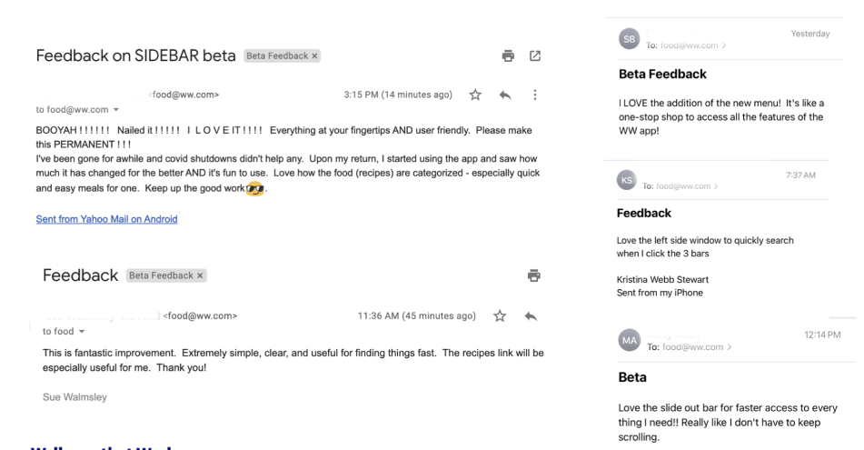
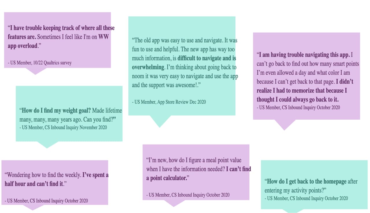
Qualitative feedback
Emails of direct member feedback
Tree testing
Tracking task success
Purchasing task success
Explorative task success
Social & Community task success
Journey Progress task success
A/B testing
Navigation assistance customer service inquiries
Usability assistance customer service inquiries
Avg traffic to key app areas via Menu
Avg traffic to tracking actions via Consolidated Tracking button
The Task
Reducing call
center volume
In 2020, 15% of all customer service inquiries were for navigational assistance, totaling around 18k calls per month. This meant that navigational issues were costing the company millions per year in calls alone.
Our goal was to identify learnings to help us better understand how to organize the WW app to make it more intuitive for current and future members.
The Challenge
Measuring what is intuitive,
not what is learnable
As we looked at ways to test and validate different ways of organizing the app, we determined that it would be better to learn first about users initial expectations.
To test what was intuitive, we used tree testing to get multiple rounds of learnings in with minimal overhead. Tree testing helped us understand where participants expected to find things based on a number of given tasks and how they are named.
This method stripped away all context and asked participants to try to find things when displayed as a series of menu items.
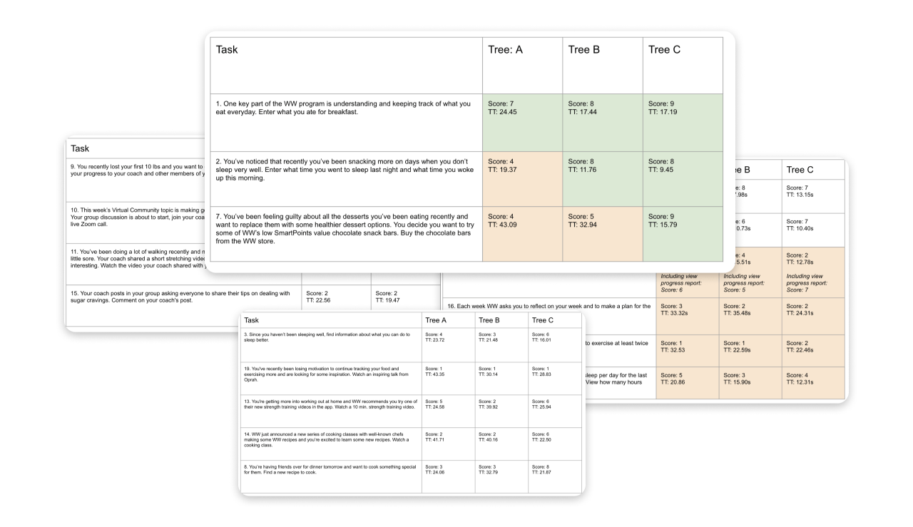
Each tree tested came with analytics per task on time taken, success rate, directness and routes taken by participants.
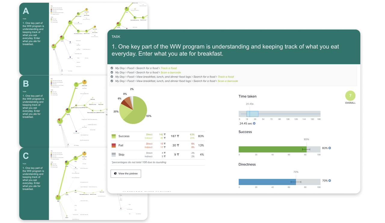
We then compared participant results per task across trees to see which ways of organizing performed best, and where we had room to iterate / improve.
The Hurdles
Delivering in phases
Although we had clear results about better ways to organize, with such a large scope of work we could not tackle everything at once.
The biggest questions were:
- How might we deliver immediate impact to members’ navigation problems?
- How might we solve navigation issues globally?
- How might we prevent additional navigation issues from arising going forward?
The Solution
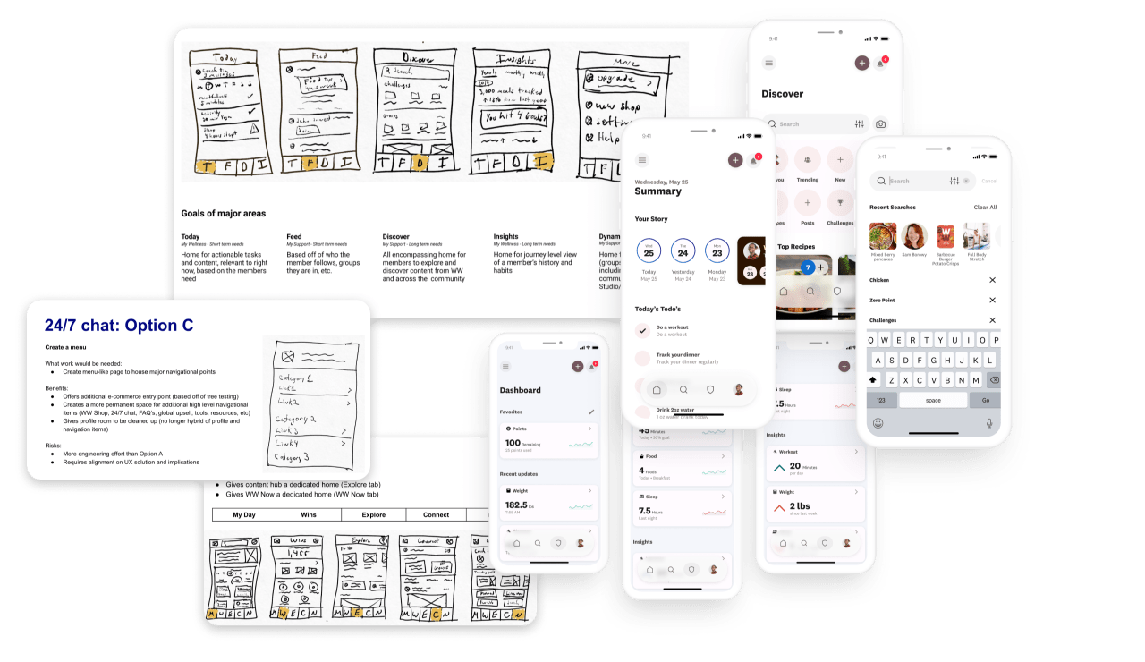
Connection through member focused frameworks
We broke up our approach to provide both short-term and long-term solves.
- Short-term – we tested and built a few ways to provide global access to a consolidated list of areas through a menu, a consolidated destination for tracking, widgets and siri shortcuts.
- Long-term – we facilitated org wide conversations about how things could be organized, with low & high fidelity examples to focus those conversations.
Short-term
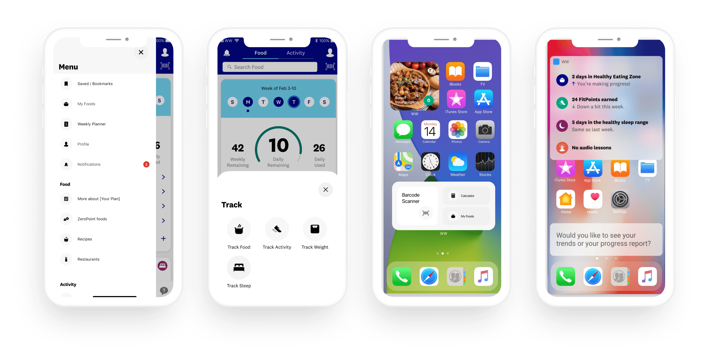
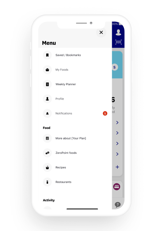
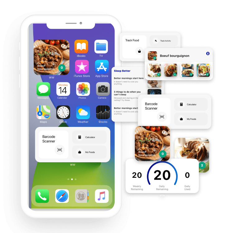
Global Menu
- A globally accessible way for members to access all major navigational points within the experience.
- A/B tested the inclusion of various areas and orders.
Short-term
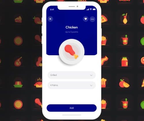
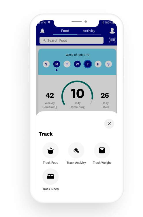
Consolidated Tracking Actions
- A globally accessible way for members to access all trackable metrics within the experience.
- A/B tested the accessibility from various areas of the experience.
Short-term
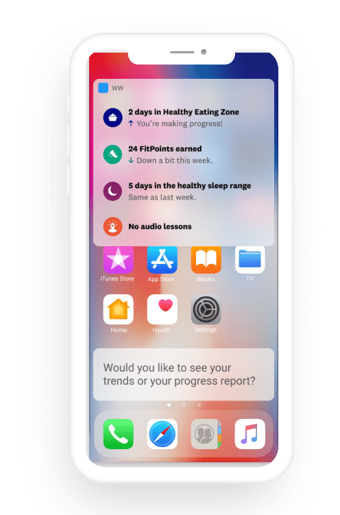
Widgets
- Enabling access to the most popular information and features at a glance.
Short-term
Siri Shortcuts
- Enabling access to the most popular information and features through voice.
Long-term strategy
Organizing through purpose
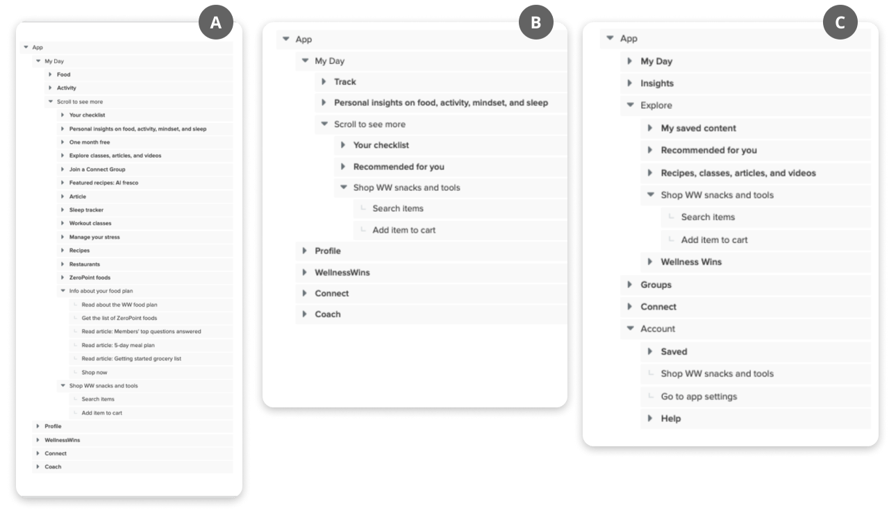
The tree testing results showed overlapping needs and functionality in certain areas of the experience.
By defining the purpose of these duplicative experiences, we built concepts at multiple levels of fidelity to reimagine these experiences in a more systematic and consolidated way.