HomeAgain
Consumer Site
HomeAgain Consumer Site
Role: UX/UI, QA, Dev
Client: HomeAgain
Date: 2017
HomeAgain is a pet microchipping service offering primarily pet management and recovery features to its users. Being 1/3 of the overall HomeAgain web presence, the consumer site is as much the product and brand as the microchip itself is.

Quick Facts
Check the Numbers
Overall Website Traffic
Organic Traffic
Net Sessions
Unique Users
Bounce Rate
Average Session Duration
The Task
Separating from the Pack
To distinguish HomeAgain from competitors as having the most technologically advanced, consumer-friendly and comprehensive suite of lost pet recovery services available. This could be done by:
- Mobile Responsive site design
- More efficient and consistent site structure and IA
- Rethinking of major form flows to improve conversions and decrease user drop-off
The Challenge
Users Over Here,
Users There, Everywhere
The site has a number of functions for new and returning users alike. Existing users are primarily interested in account management. New users look for product and service information as well as general pet owner resources. With multiple user needs and avenues to address them, it became easy for users to get lost and not easily find where they need to go.
User testing showed new users had difficulty finding general microchipping information, while returning users had trouble finding callouts to login to their account or renew their account membership.

The Hurdles
So Much to Do,
& So Little Time
- Backend java based implementation had limited ability.
- Backend dev resources for implementation were limited, so some features would have to be de-prioritized for a timely release.
- Certain primary pages needed to be designed, built, and tested before work could be done on the rest of the pages (Creating more needs for component based design)
- User testing showed users were in need of a support/help area for self servicing.
The Solution
LESS, Material Design,
& Plenty of Content
A modern, mobile first feel with UX improvements for the benefit of the user. Warm colors, lifestyle imagery, simplified content, and streamlined navigation all contribute to a much more supportive display of the product.
Rebuilding HomeAgain Efficiently
Reusable Components to Not Reinvent the Wheel


Card Based Design
Easy to update cards that can go anywhere

Adaptable Components
Component based banners and other visual elements
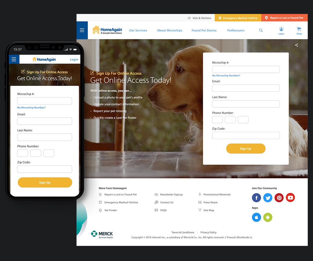
Forms
Simplified forms to increase conversions

Zendesk
Support site built to better service customer needs

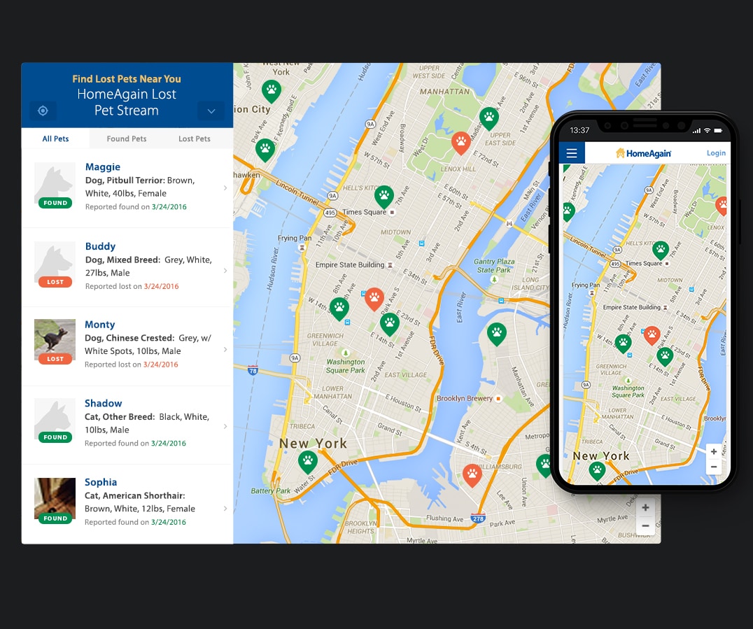
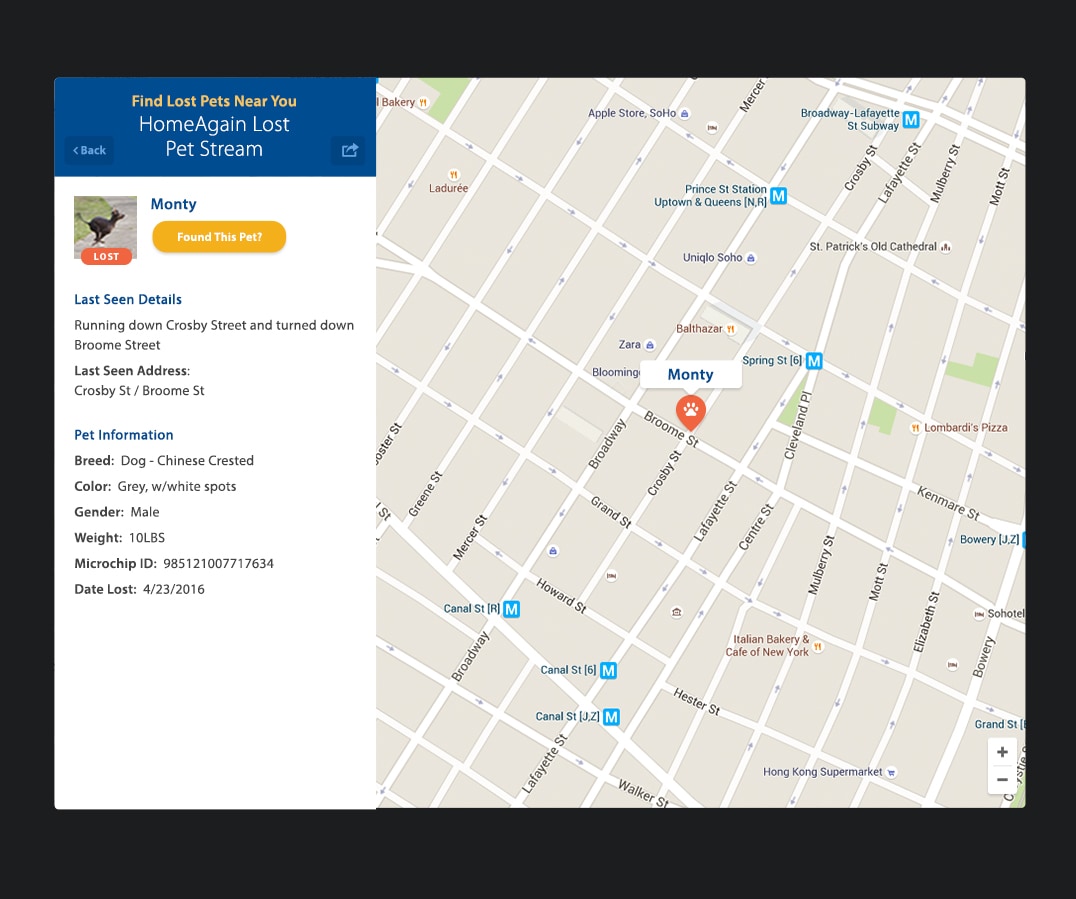
PetRescuers Lost Pet Stream
Customized map showing lost and found pets in any given area
Simplified Registration
Consolidated registration form with less fields and less steps for the user
Support Site
Custom built support area via Zendesk for better customer support