ConvaTec
Ostomy Form Enhancements
Ostomy Form Enhancements
Role: Concept, UX/UI, Dev
Client: ConvaTec
Date: 2017
ConvaTec Ostomy is one of the many areas ConvaTec offers medical products and services. The sample request and me+ signup are two major parts of the ostomy divisions overall strategy.
The Task
A Test A Day Keeps
The Doctor Away
We were tasked to design a few versions of the ostomy sample request form and me+ enrollment form. The goal was to begin A/B testing different versions to improve the forms overtime and further increase conversions.

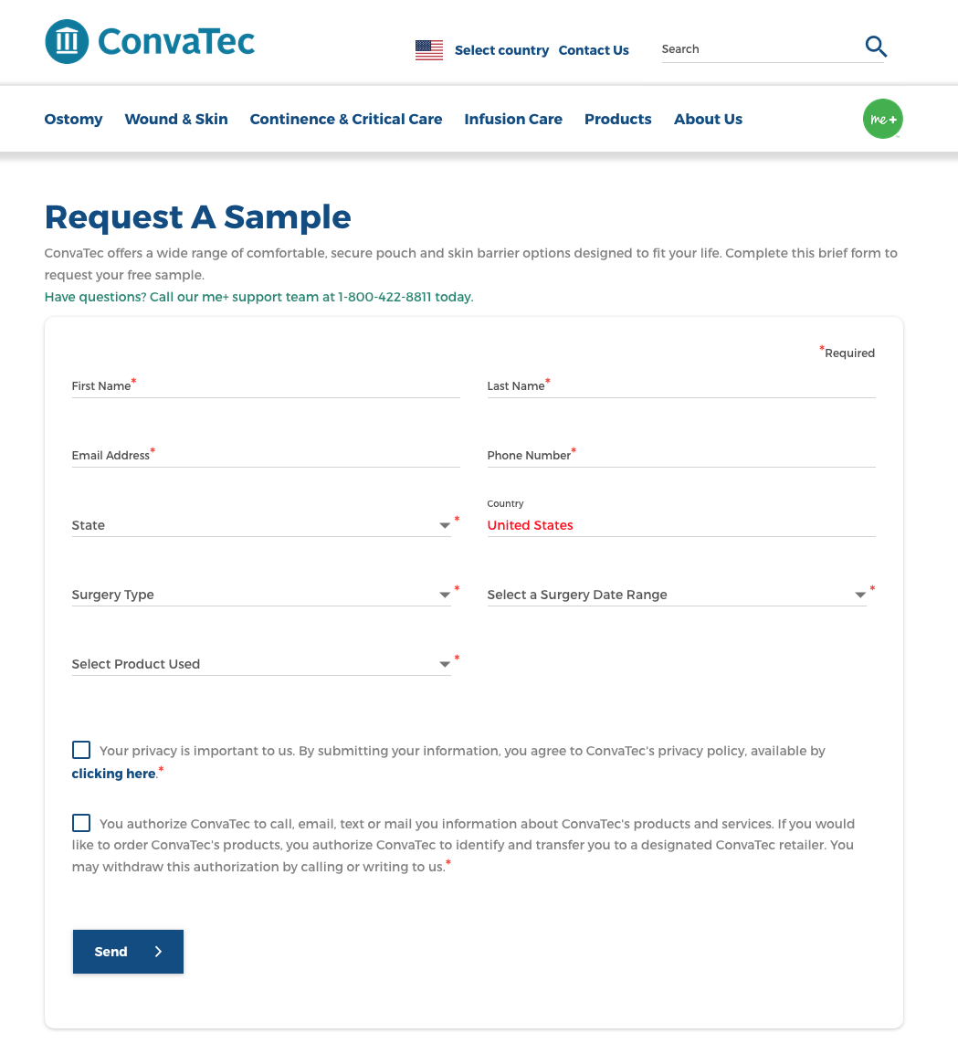
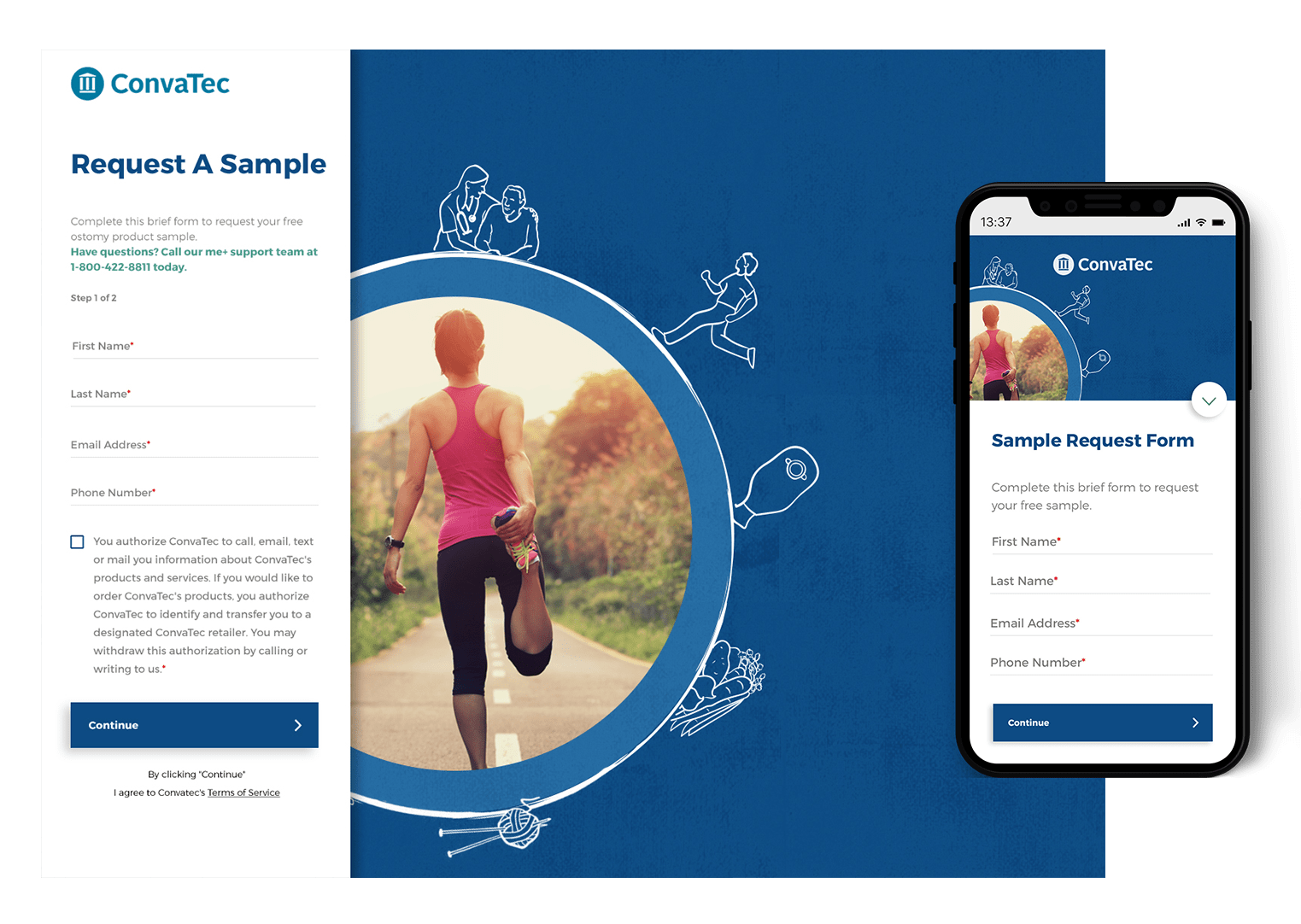
Sample Form
Long Form, Visually Bare
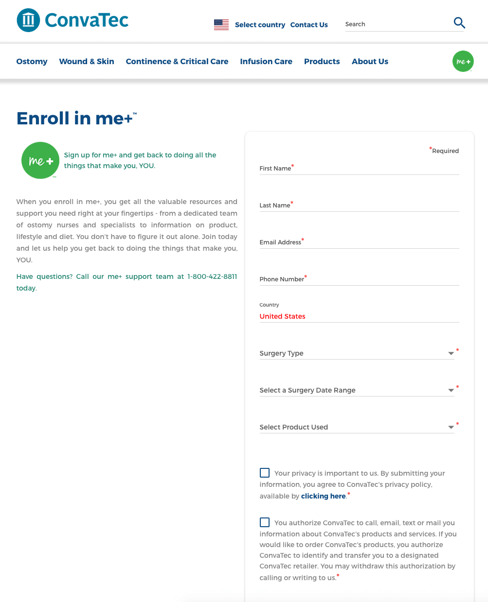
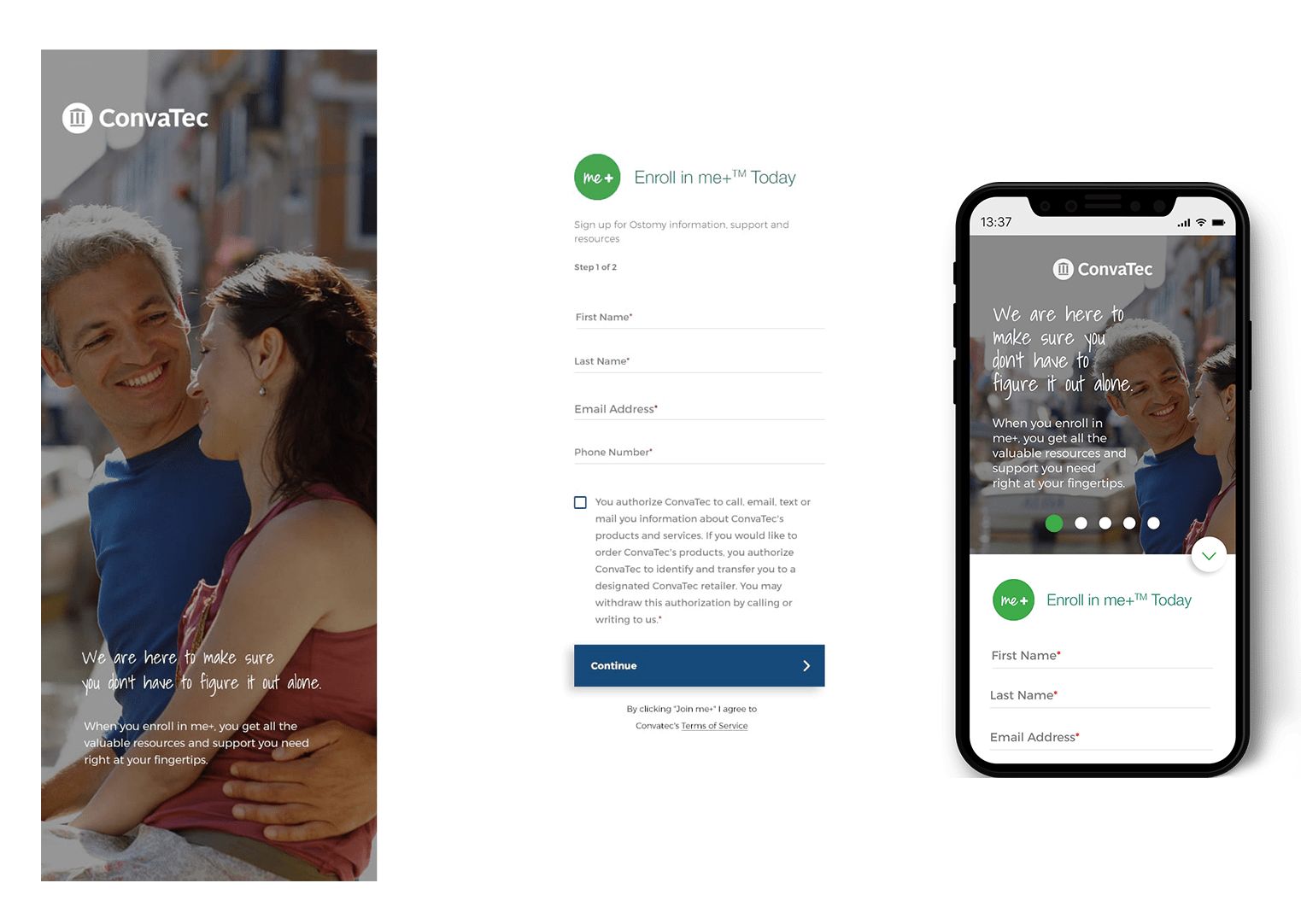
Join Me+ Form
Long Form, Details Not Explained
The Challenge
Upgrading From
The Barebones
The sample request form and the join me+ form both lacked visual appeal. The language needed improvement and forms appeared long on mobile.
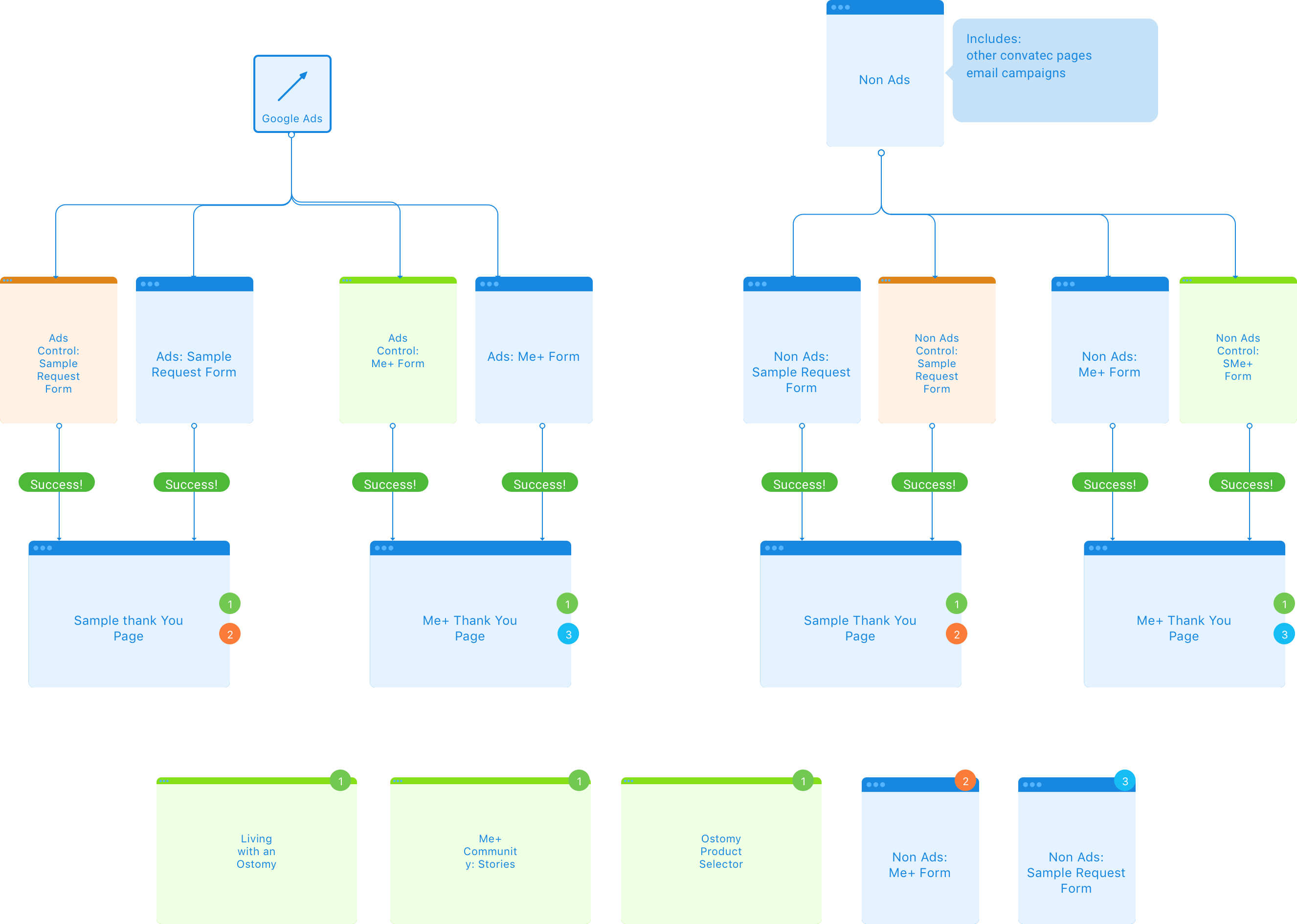
Various SEM campaigns, ads, and email initiates were all funneling users into the same two forms. Without multiple versions of each, there was no clear data to explain what was successful about the forms and what was not.
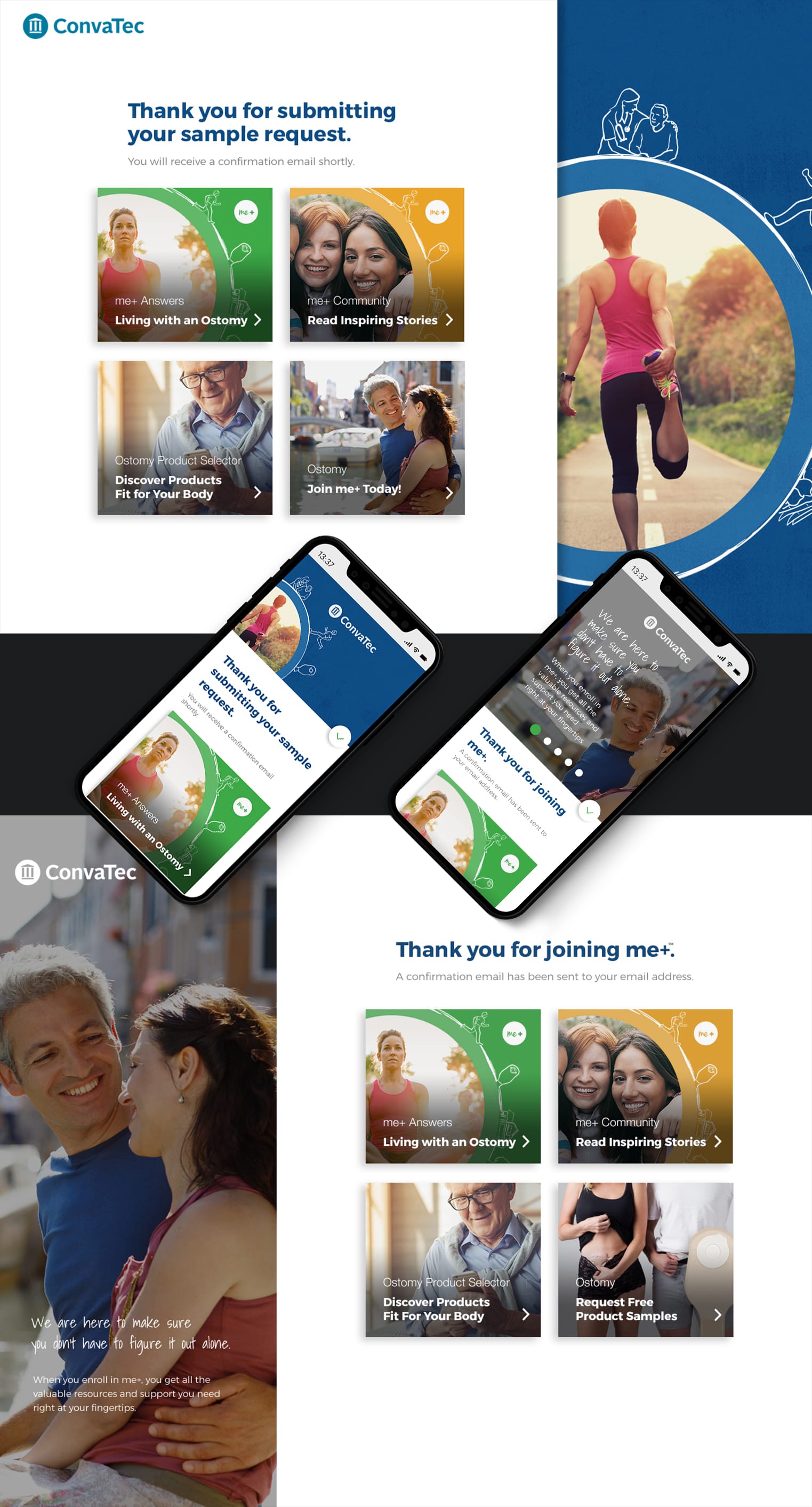
Additionally, the thank you pages had some issues. Both form thank you’s provided brief messaging, giving the user no additional points of action. The functionality itself was done via AJAX and thus there wasn’t a unique url string for the pages, making analytics difficult to track.
The Hurdles
Sometimes Division
is a Good Thing
The same two forms were being used in all cases. This method made different user paths and needs difficult to address. At minimum, a separate ad form would be needed for each of the forms. More versions could be tested over time.
User testing of the me+ form showed there was a need to further explain the benefits of the program.
The Solution
Search for What You Want,
Discover What You Need
We built a new content from the ground up. Using the me+ branches as a starting point, we were able to efficiently assign roles and purposes for each section in a way that would benefit the client and consumers. User generated content was given its own place to better serve users and provide a community feeling. Branded content via the client was given a place without getting in the way of the real value of the hub which is its user community.
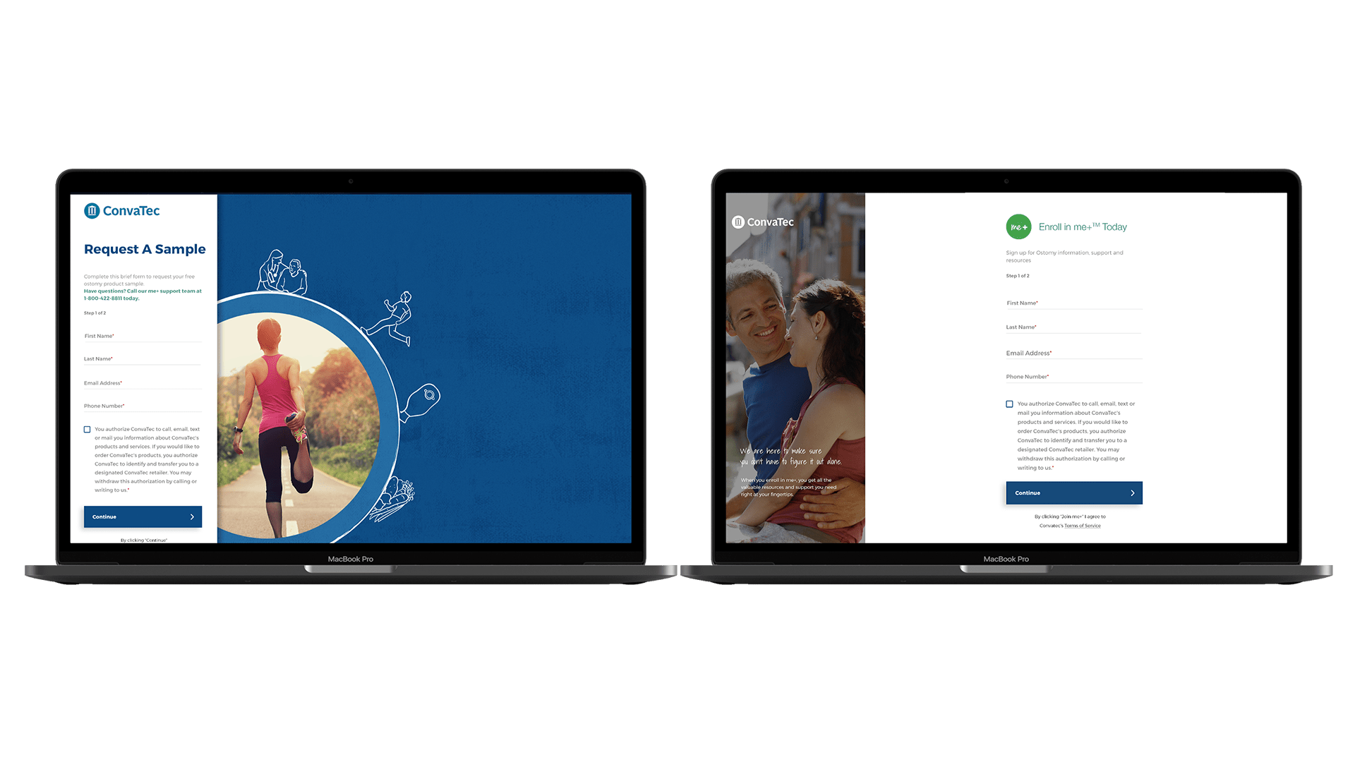
Sample Request Forms
Two visually identical forms, with one focusing on ads.
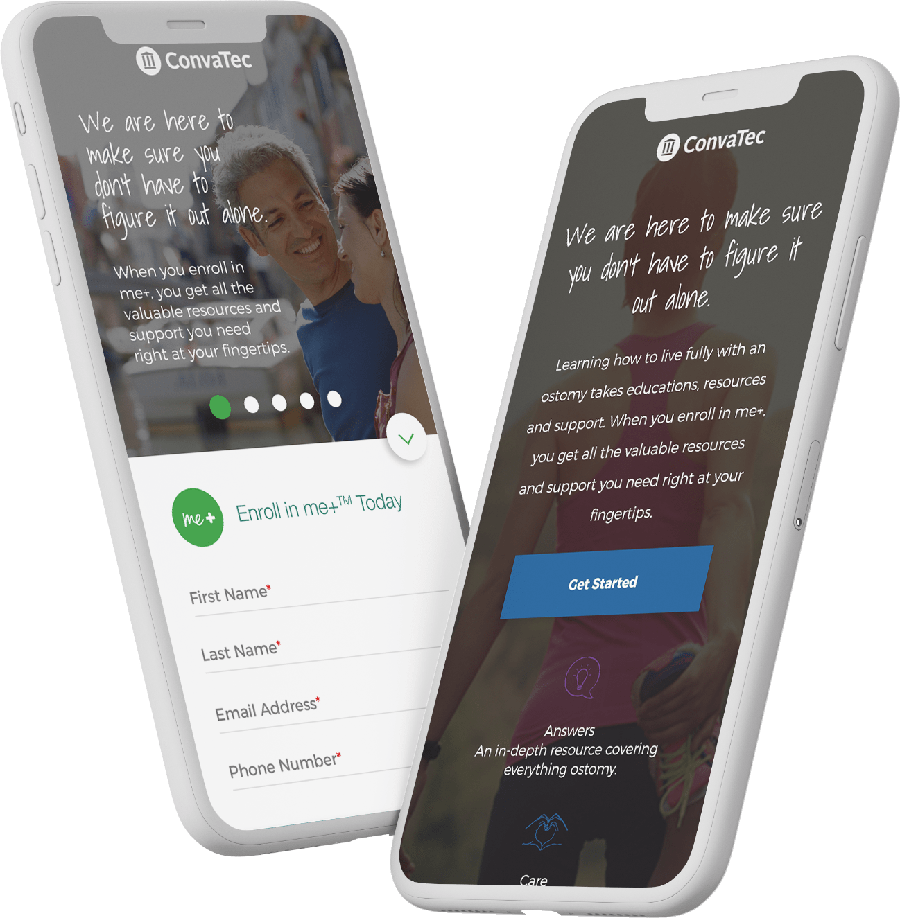
Join me+ Ads
A new landing page for ads, explaining the major points of the me+ program all in one place.
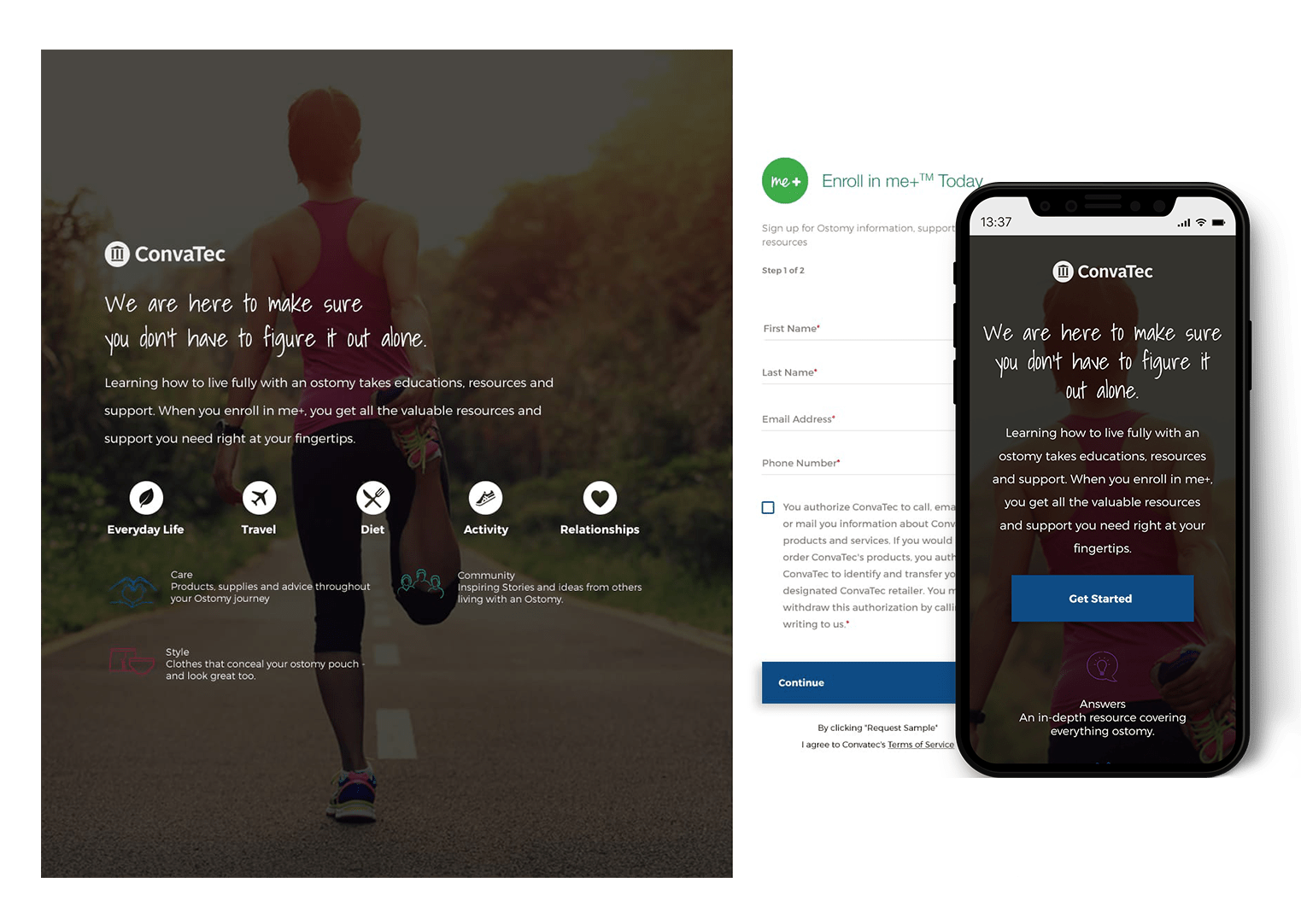
Join me+ (non ads)
A new landing page for all non ad related links, explaining each section of the me+ program in depth.
Thank You Pages
Separate html thank you pages, with important calls to action for the user